

Data Analytics Beyond Dashboards: Unveiling the Art of Data Storytelling

In the ever-evolving realm of Data Analytics, one aspect stands out as a linchpin for effective communication – the visualization of results and findings. It’s not merely about numbers, facts, and measurements; it’s about weaving a narrative that resonates with the target audience. Data Visualization serves as the translator of complex analyses, ensuring that insights are not just discovered but also understood. In this journey through the data landscape, two protagonists emerge, Dashboards and Data Storytelling.
Data Visualization is the tool analysts employ to breathe life into their analyses. Its purpose extends beyond mere aesthetics; it’s the conduit through which trends and insights are conveyed to the intended audience. To wield this tool effectively, we must answer the crucial questions of WHO, WHAT, and HOW. Understanding the audience narrows the focus, determining what information is relevant and how it should be presented.
The Power of Dashboards:
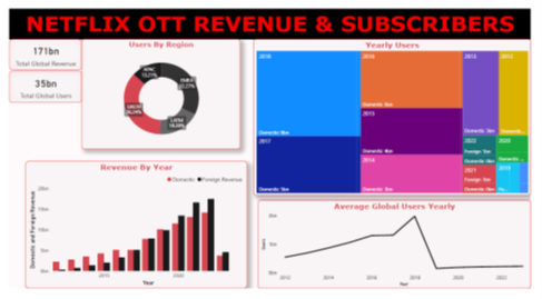
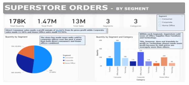
Data Dashboards – the dynamic presentations that transform raw data into a visual symphony. Dashboards go beyond presenting critical metrics and Key Performance Indicators (KPIs); they are visual narratives that simplify complex relationships. Utilizing charts, graphs, tables, and figures, dashboards create a visually interactive and informative experience for organizations. They serve as the gateway to exploratory analysis, unravelling insights and noteworthy findings.
However, dashboards, while powerful, introduce an element of subjectivity. Their effectiveness hinges on the analyst’s ability to guide the audience through filtering and interactive visualizations, making them dependent on the audience’s expertise and knowledge.
The Rise of Data Storytelling:
As data analysts strive for clarity and comprehension, a new contender emerges – Data Storytelling. This approach goes beyond the confines of dashboards, weaving a narrative into visualizations. It adds context, making it less subjective and enhancing the explanatory analysis. In essence, Data Storytelling is the upgrade we need to bridge the gap between complex data and audience understanding.
Why Analysts Prefer Data Storytelling:
In the digital age, analysts and organizations are increasingly favouring Data Storytelling over traditional dashboards. Sharing insights online requires more than just presenting data; it demands a comprehensive understanding. Data Storytelling provides the edge by offering descriptions of visualizations that cater to both novices and experts alike.
Unlike dashboards, Data Storytelling maintains context, ensuring that the nuances of the analysis are not lost in translation. It maximizes communication, focusing on specific information rather than inundating the audience with data overload. Analysts now recognize the importance of guiding their audience through the data journey, leaving no room for misinterpretation.
In the world of Data Analytics, beautiful dashboards are not the end goal; they are merely a means to an end. Beyond the captivating designs and graphics lies the true art of storytelling. Data is a language, and the efficiency of its conversation depends on the storyteller’s ability to articulate the mind of the analyst. As we navigate the data landscape, let us remember that the story behind the visuals is what truly captivates and enlightens the audience.
Author: Owen Gilbert
(Data Analytics Storyteller)
